Table of Contents
Introduction to LED Motion
In the bustling digital landscape of modern commerce, catching a customer's eye is harder than ever. Traditional static banners are often filtered out by our subconscious minds as "background noise." This is where the High-Impact Scrolling Banner becomes an essential tool in your marketing arsenal. By utilizing movement and light, these banners trigger primitive evolutionary responses—we are naturally wired to track motion for survival.
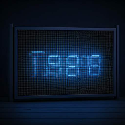
To create a truly impactful scroller, you must understand that it's more than just text on a screen; it's a living part of your environment's aesthetic. The "Cyberpunk" aesthetic—characterized by neon blues, deep purples, and electric greens—isn't just a trend; it's a high-contrast style that demands attention even in daylight.
The Psychology of Scrolling Text
Why does scrolling text work? The "Eye-Tracking" phenomenon suggests that humans will naturally follow the horizontal movement of text, even if they don't intend to read the full message. This creates a subconscious "imprint" of your brand name or offer.
| Feature | Traditional Banner | Scrolling LED Banner |
|---|---|---|
| Attention Rate | Low (Subconscious Ignoring) | High (Motion Triggered) |
| Update Speed | Hours/Days (Reprinting) | Instant (Digital App) |
| Visibility | Ambient Light Dependent | Self-Illuminating (Neon Effects) |
| Content Capacity | Limited Space | Unlimited (Looping Text) |
Core Design Principles
When designing for an LED matrix, "Less is More" is your golden rule. Avoid thin, serif fonts as they tend to blur or flicker when moving across a low-resolution pixel grid. Stick to thick, bold, sans-serif typefaces.
- Speed Control: If the text moves too fast, it becomes unreadable. If too slow, it loses the "motion trigger" effect. Aim for 3-5 words per second.
- Contrast Ratios: Use the dark mode principle. A deep black background with bright neon accents ensures maximum legibility and reduced eye strain.
- Visual Breathing Room: Always include at least 10% empty space at the top and bottom of your scroller to prevent the "cramped" look.